# loading the packages
library(readr)
library(tidyverse)
library(stringr)
library(ggthemr)
library(gganimate)
library(formattable)
# load the theme flat dark
ggthemr("flat dark")
# reading the data
bridges <- read_csv("baltimore_bridges.csv")
#View(bridges)
# naming the columns
names(bridges)<-c("lat","long","County","Carries","Year Built",
                  "Condition","Average Daily Traffic","Total Improvement",
                  "Month","Year","Owner","Responsibility","Vehicles")
attach(bridges)Week 35: Baltimore Bridges
Bridge Data and Baltimore
Data for the analysis and description about the Baltimore bridges are hyper-linked.
Data on bridges is of week 35 from TidyTuesday. Trying to explain the data using maps is obvious, yet I will use animated jitter plots. There are 13 variables and 2079 observations. Brave choice of limiting my self to less than 10 variables, where latitude, longitude and Vehicles will not be taken into account.
So with the help of packages tidyverse, ggthemr, gganimate,formattable and readr I will complete this analysis. Most of the bridges are owned by several agencies, but I will only focus on the top three ownership holders.
Counties which have bridges owned by State Highway Agency
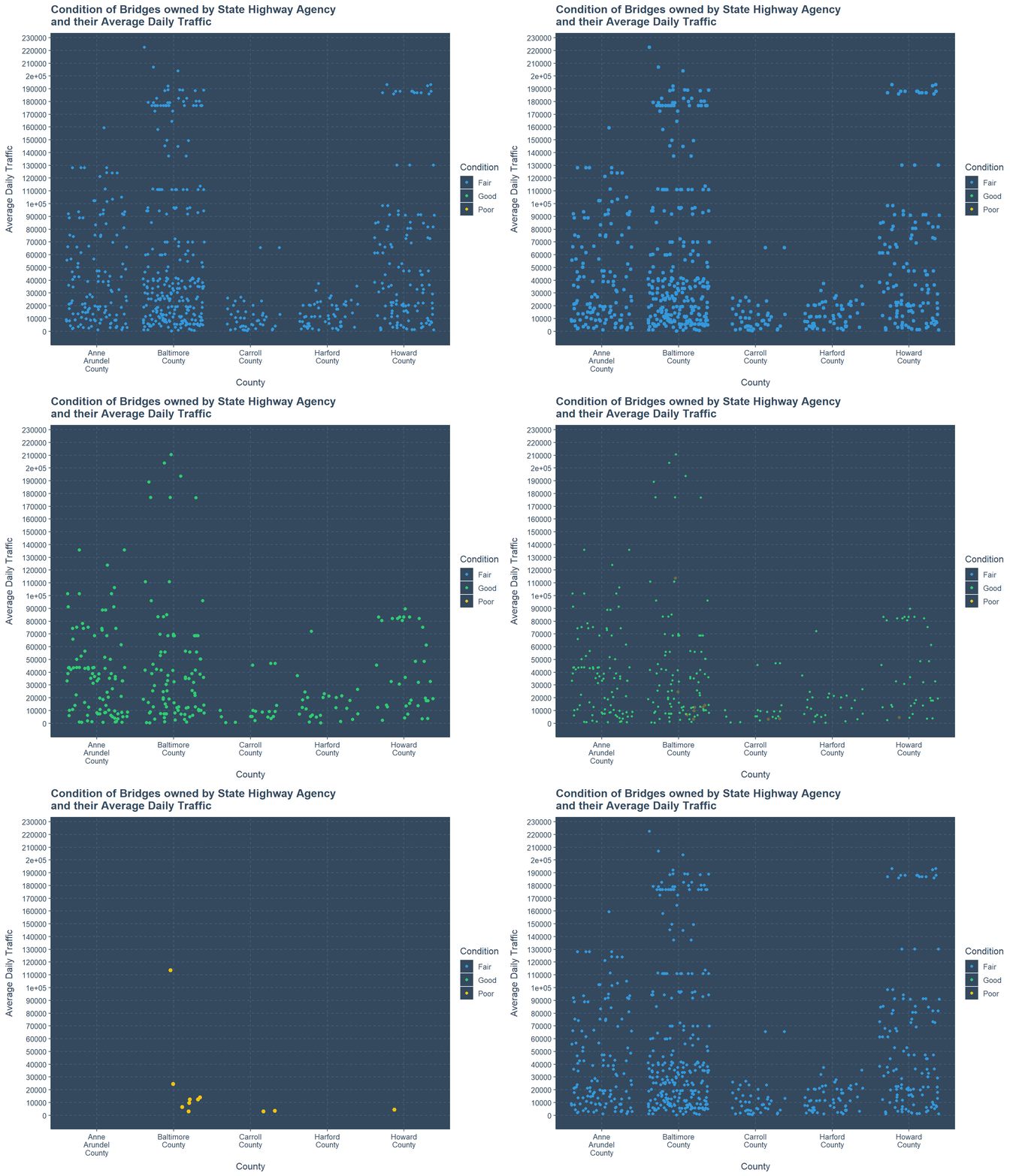
Close to 1000 bridges are owned by State Highway Agency, where most of them are in Baltimore County. High amount of bridges are in good condition, further more bridges are in Fair condition and only around 10 bridges in Poor condition.
Considering the Average Daily Traffic only one bridge in Poor condition has the amount of close to 110,000, while all the other poor condition bridges have Average Daily Traffic less than 30,000. Counties Anne Arundel and Hartford have no Poor condition bridges at all.
Most of the bridges are from Baltimore County and around 20 bridges have count of more than 150,000 Average Daily Traffic for both Fair and Good conditions. Hartford and Carroll Counties have their Average Daily Traffic which does not exceed 80,000 at any condition of the bridge.
# jitter plot to State Highway Agency
ggplot(subset(bridges,Owner=="State Highway Agency")
       ,aes(color=Condition,y=`Average Daily Traffic`,x=str_wrap(County,7)))+
  xlab("County")+
  ggtitle("Condition of Bridges owned by State Highway Agency \nand their Average Daily Traffic")+
  scale_y_continuous(labels =seq(0,230000,10000) ,breaks = seq(0,230000,10000))+
  transition_states(Condition,transition_length = 2,state_length = 3)+
  enter_fade()+exit_shrink()+ease_aes("back-in")+geom_jitter()
Counties which have bridges owned by County Highway Agency
County Highway Agency owns the second most amount of bridges in this data-set. Therefore using jitter plots we are going to check how the condition of the bridges and counties are explained in the simplest manner.
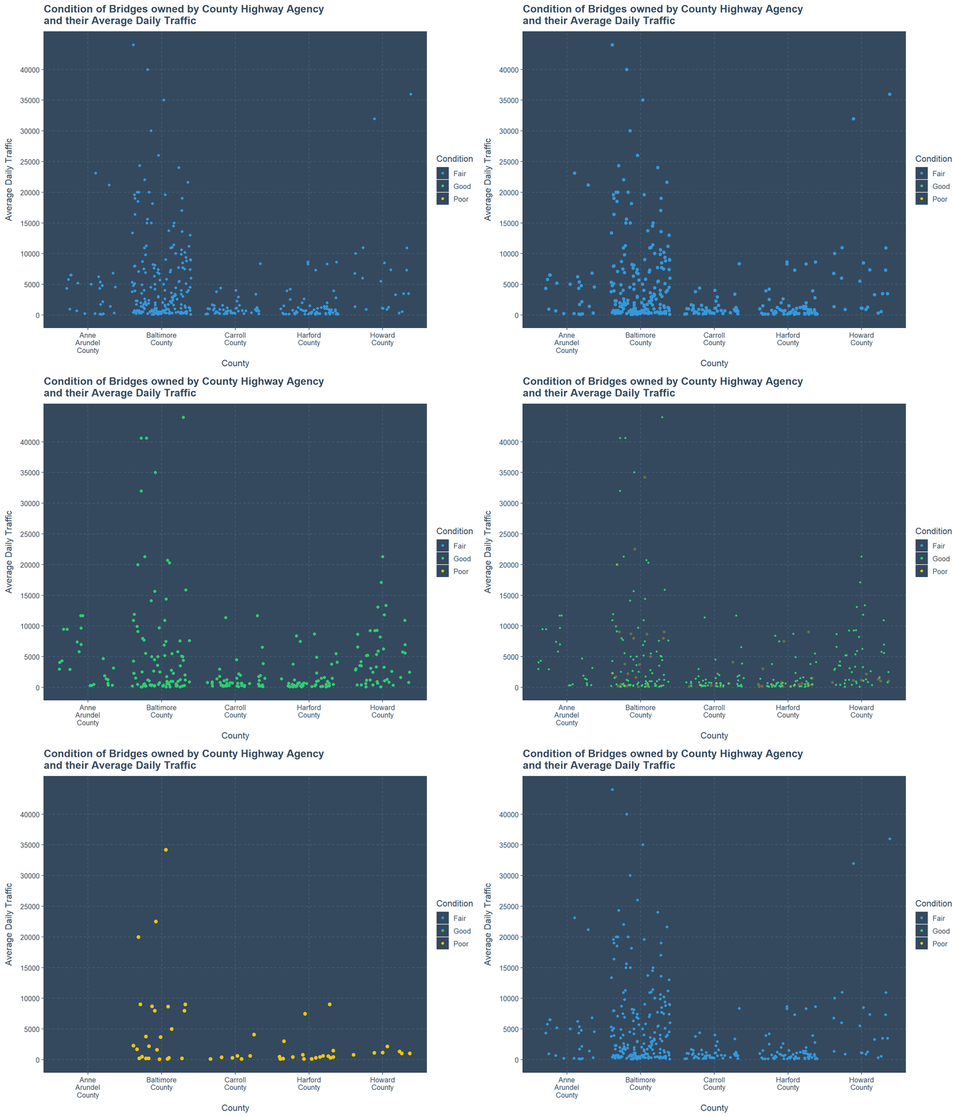
Less amount of poor condition bridges in all counties except Anne Roundel County. All bridges owned by County Highway Agency have a limited Average Daily Traffic less than 50,000. Clearly we have more Fair bridges than Good ones. In the Poor condition category only two have Average Daily Traffic more than 20,000, while other two have more than 10 bridges.
Most of these bridges are in Baltimore County even it is in any one of three conditions. There are few bridges which have values more than 40,000 Average Daily Traffic and they are also in Baltimore County.
There are bridges which have Zero Average Daily Traffic. In all three Conditions only Hartford County has bridges which has Average Daily Traffic less than 10,000.
# jitter plot to County Highway Agency
ggplot(subset(bridges,Owner=="County Highway Agency")
       ,aes(color=Condition,y=`Average Daily Traffic`,x=str_wrap(County,7)))+
  xlab("County")+ geom_jitter()+
  ggtitle("Condition of Bridges owned by County Highway Agency \nand their Average Daily Traffic")+
  scale_y_continuous(labels =seq(0,40000,5000) ,breaks = seq(0,40000,5000))+
  transition_states(Condition,transition_length = 2,state_length = 3)+
  enter_fade()+exit_shrink()+ease_aes("back-in")
Most amount of bridges Built based on Year
Years 1957, 1970, 1975, 1991, 1963 and 1961 have the top 6 spots for building more than 50 bridges in those years. If we consider the conditions of Fair and Good only the year 1991 is suitable to be mentioned, while all other years has at-least one Poor condition bridge. Further There are more Poor condition bridges in 1961 than in 1957. While all Poor condition bridges has Average Daily Traffic less than 50,000.
Finally, there are only few bridges which have Average Daily Traffic above 100,000 and only 3 are in Good condition. There are Bridges which can have Average Daily Traffic close to zero in all 6 years and all conditions.
# jitter plot to years based on Most amount of bridges built
ggplot(subset(bridges,`Year Built`=="1957" | `Year Built`=="1970" |
                `Year Built`=="1975" | `Year Built`=="1991" |
                `Year Built`=="1963" | `Year Built`=="1961")
       ,aes(color=Condition,y=`Average Daily Traffic`,x=factor(`Year Built`)))+
  xlab("Year Built")+ylab("Average Daily Traffic")+
  ggtitle("Most amount of Bridges built based on Years \nand their Conditions")+
  geom_jitter()+legend_bottom()+
  transition_states(Condition,transition_length = 2,state_length = 3)+
  enter_fade()+exit_shrink()+ease_aes("back-in")
Average Traffic Less than or equal to 100,000 for Counties with Bridge Condition
While obtaining summary for county variable there is one issue because there are two observations which say “Baltimore city” than “Baltimore City” and I don’t want to change them.
If we focus on Average Daily Traffic less than or equal to 100,000 based on County and Condition. It is clear that Poor condition bridges are part of this criteria and mostly Average Daily Traffic is less than 5000 for Counties Howard, Hartford and Carroll. While Baltimore County has highest amount up-to 75,000, but Baltimore County has highest amount close to 40,000 for Average Daily Traffic. Finally Anne Arundel County has only one Poor condition bridge which has Average Daily Traffic close to zero.
We can see that there are more Fair Condition bridges than Good ones. In Baltimore County most of the Fair condition bridges have Average Daily Traffic less than 15000. Similarly Carroll county and Hartford county also behave under such criteria. But for Good condition bridges this is not the case where there is no certain strong dense region as similar to Fair condition bridges.
Previously when we looked into county we did not see Baltimore City often as a factor, but here that is not the case.
# jitter plot to average daily Traffic less than or equal 1000000
ggplot(subset(bridges,`Average Daily Traffic`<=100000 & County!="Baltimore city"),
       aes(x=County,y=`Average Daily Traffic`,color=Condition))+
  xlab("County")+ylab("Averag Daily Traffic")+
  ggtitle("Average Daily Traffic Less than 100,000 \nFor Counties")+
  scale_y_continuous(labels = seq(0,100000,5000),breaks = seq(0,100000,5000))+
  theme(axis.text.x = element_text(angle = -90))+coord_flip()+ geom_jitter()+
  transition_states(Condition,transition_length = 2,state_length = 3)+
  enter_fade()+exit_shrink()+ease_aes("back-in")
Average Traffic More than 100,000 for Counties with Bridge Condition
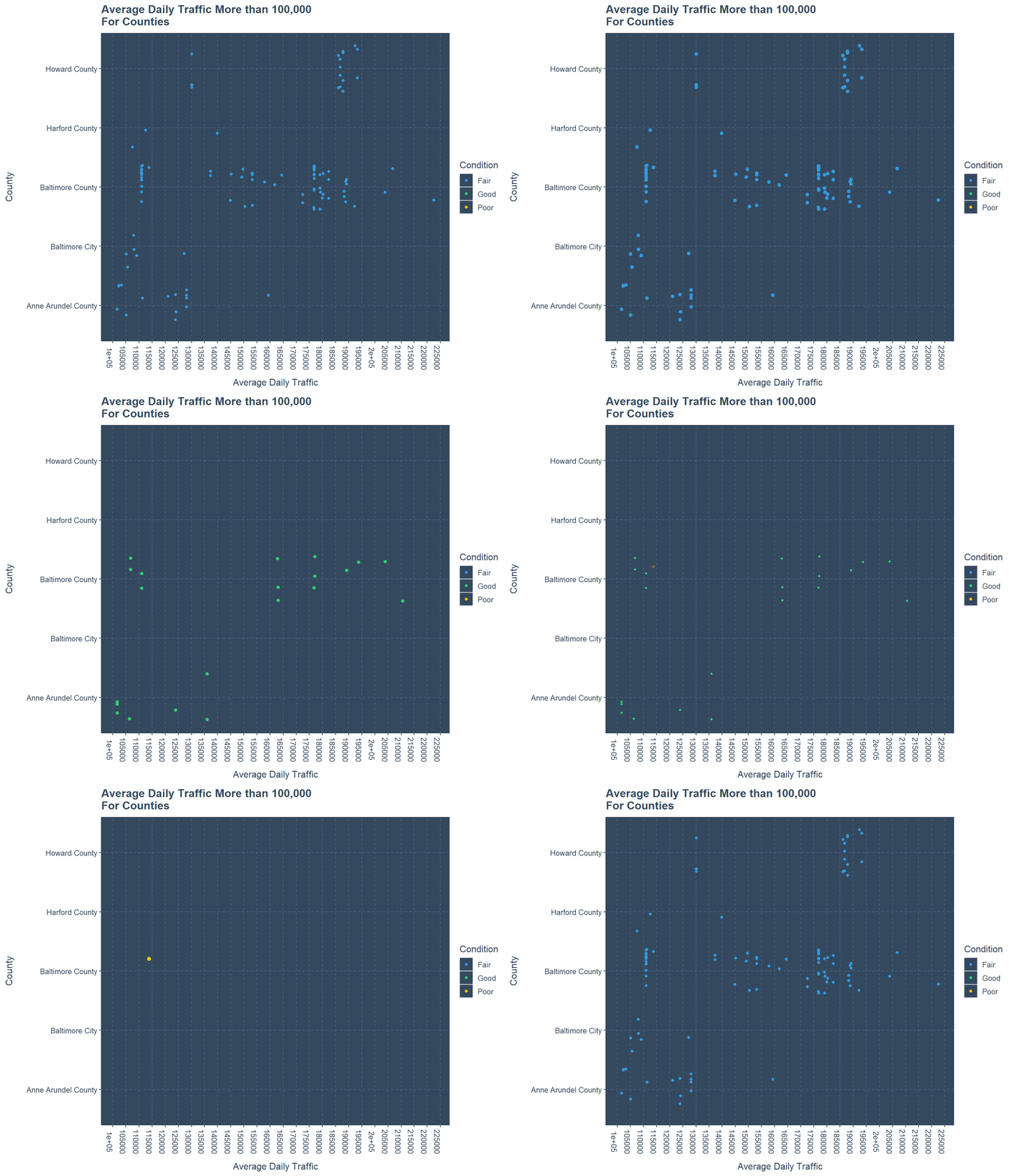
This Jitter plot is completely different than previous one, because there are no clear dense regions for any counties and conditions of the bridge. There is only one Poor condition bridge in Baltimore County where the Average Daily Traffic is close to 115,000. In Fair condition bridges also Baltimore County holds the most, while they are slightly dense in the region of 175,000 to 190,000. while for Howard County similar density occurs between 190,000 to 205,000. Bridges in Good condition have more higher values in Baltimore County than Anne Arundel County.
# jitter plot to average daily Traffic more than  1000000
ggplot(subset(bridges, `Average Daily Traffic` > 100000 & County != "Baltimore city"),
       aes(x=County,y=`Average Daily Traffic`,color=Condition))+
  xlab("County")+ylab("Average Daily Traffic")+
  ggtitle("Average Daily Traffic More than 100,000 \nFor Counties")+
  scale_y_continuous(labels=seq(100000,230000,5000),breaks=seq(100000,230000,5000))+
  coord_flip()+ theme(axis.text.x = element_text(angle = -90))+
  geom_jitter()+transition_states(Condition,transition_length = 2,state_length = 3)+
  enter_fade()+exit_shrink()+ease_aes("back-in")
Improvement and Bridge Conditions with Counties
In the variable of Total Improvement there are 1438 missing values, 42 values are zero and the rest are actual values. I am going to look at Total Improvement in two tables. First table will include where Bridges have Total Improvement higher than 9,999,000 USD and less than 30,000,000 USD. Second table is for Bridges which have Total Improvement higher than or equal to 30,000,000 USD.
Further to make these tables interesting I will be using the package formattable, and colors and tiles for numerical values. In the first table there are 7 bridges while only Anne Arundel County holds 3 and Baltimore City holds 4. One bridge is from 1953, and others are from the period of 1977 to 1983. Conditions of these bridges are mostly Fair and two bridges are in Good condition. Lowest Average Daily Traffic is 11760, while highest is 124193, where both bridges are in Fair Condition, and the amount spent on them for Total Improvement are respectively 18,163,000 USD and 16,264,000 USD. The bridge with Highest amount of Average Daily traffic is built in 1953.
# removing unnecessary columns and setting restriction to
# Total Improvement
Top10<-subset(bridges[,c(-1,-2,-9,-10,-11,-12,-13)],
              `Total Improvement` > 9999 & `Total Improvement` < 30000)

# setting colours
customRed0 = "#FF8080"
customRed = "#7F0000"

customyellow0 = "#FFFF80"
customyellow = "#BFBF00"

customblue0 = "#6060BF"
customblue =  "#00007F"

# creating the table for above data set
formattable(Top10,align=c("l","l","c","c","c","c"),
            list(
              County =formatter("span",style= ~style(color="grey")),
            `Total Improvement`=color_tile(customblue0,customblue),
            `Average Daily Traffic`=color_tile(customyellow0,customyellow),
            `Year Built`=color_tile(customRed0,customRed)
))| County | Carries | Year Built | Condition | Average Daily Traffic | Total Improvement |
|---|---|---|---|---|---|
| Anne Arundel County | MD 2 | 1983 | Fair | 53221 | 13504 |
| Anne Arundel County | US 50 | 1953 | Fair | 124193 | 16264 |
| Anne Arundel County | UPPER LEVEL ROADWA | 1977 | Fair | 11760 | 18163 |
| Baltimore City | IS 95 SB | 1977 | Fair | 94765 | 15785 |
| Baltimore City | IS 95 VIADUCT SB | 1980 | Good | 63650 | 16051 |
| Baltimore City | IS 95 VIADUCT NB | 1980 | Fair | 52850 | 20484 |
| Baltimore City | IS 95 SB | 1980 | Good | 55621 | 20484 |
When I did try to plot the top ten bridges with most Total improvement values there was one issue, which is the distance between first two values and the next 8 values. Therefore I divided the table into two.
In this second table We can see there are two bridges which are from Baltimore City and are built in 1980 and 1971, but the amount spent on Total Improvement is 300,000,000 USD each. But their Average Daily Traffic is respectively 56280 and 30600.
While we have another bridge from Baltimore City and built in 1907, but Total Improvement amount is 35,026,000 USD. Here, the Average Daily Traffic is 3900.
# removing unnecessary columns and setting restriction to
# Total Improvement
Top3<-subset(bridges[,c(-1,-2,-9,-10,-11,-12,-13)], `Total Improvement` >= 30000)

# setting colours
customRed0 = "#FF8080"
customRed = "#7F0000"

customyellow0 = "#FFFF80"
customyellow = "#BFBF00"

customblue0 = "#6060BF"
customblue =  "#00007F"

# creating the table for above data set
formattable(Top3,align=c("l","l","c","c","c","c"),
            list(
              County =formatter("span",style= ~style(color="black")),
            `Total Improvement`=color_tile(customblue0,customblue),
            `Average Daily Traffic`=color_tile(customyellow0,customyellow),
            `Year Built`=color_tile(customRed0,customRed)
))| County | Carries | Year Built | Condition | Average Daily Traffic | Total Improvement |
|---|---|---|---|---|---|
| Baltimore City | US 40 EDMONDSON AV | 1907 | Poor | 3900 | 35026 |
| Baltimore City | IS 95 VIADUCT SB | 1980 | Fair | 56280 | 300000 |
| Baltimore City | EASTERN AVENUE | 1971 | Fair | 30600 | 300000 |
Conclusion
My conclusion of the above plots and tables in point form
Jitter plots and animation are useful in explaining one continuous variable with multiple categorical variables.
Sub-setting the data set and applying formattable package is useful to explain different continuous values with in a table.
Further Analysis
- Similarly we can use mapping to point out the locations of the bridges and use animation to make it more clear.
Please see that
This is my fifth post on the internet so please be kind to tolerate my mistakes in grammar and spellings. I intend to post more statistics related materials in the future and learn accordingly. Thank you for reading.
THANK YOU
