Week 24: Meteorite Data
This week has data for Meteors from 8th century to year 2013(well 2101 is an error).
So I have used the packages tidyverse,gganimate,maps and ggthemes to make this more interesting. There are three plots which I have generated, two of them are inspired by others.
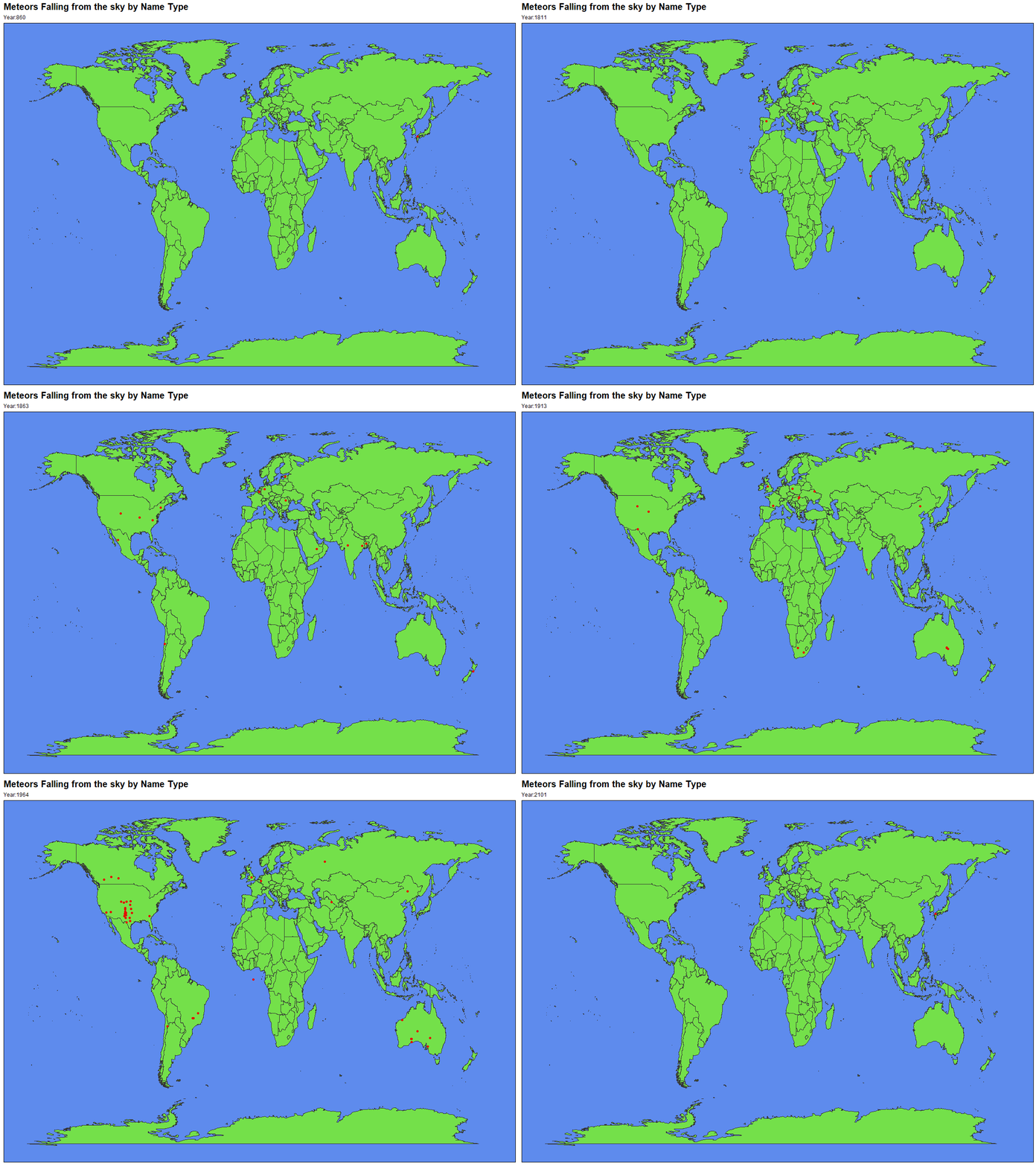
Meteorites over the Year
Based on the below tweet I was inspired to creata a similar plot which is animated by years.
Frames change is based on year, and meteors which have missing values are dropped.
meteorites_rm<-remove_missing(meteorites)

world <- ggplot() + theme_map()+
         borders("world", colour = "#353535", fill = "#74e04a")

plot1<-world+geom_point(data=meteorites_rm,x=meteorites_rm$long,y=meteorites_rm$lat,
                        color="#e20e06")+
             transition_states(meteorites_rm$year,transition_length = 1,state_length = 1)+
             theme(plot.title = element_text(color = "black",
                                           size = 15,
                                           face = "bold"),
                   panel.background = element_rect(fill = "#5e8bed")) +
             ggtitle("Meteors Falling from the sky by Name Type",subtitle = "Year:{closest_state}")

animate(plot1,nframes=253,fps=1,detail = 1)
Meteorites and Classes
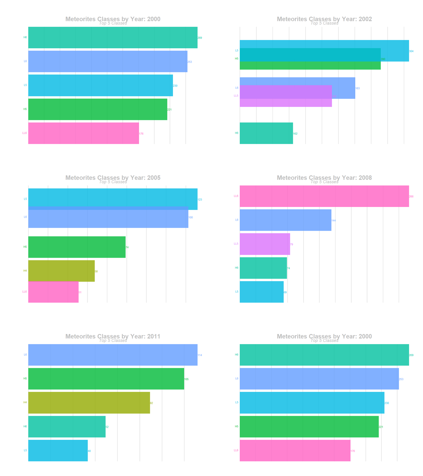
A Bar plot which changes for the top 5 classes based on their counts after the year 1999. This plot is based on the blog post published in Rbloggers. This type is a very popular animated bar plot.
test<-meteorites%>%
          subset(year >= 2000 & year < 2101) %>%
          group_by(year,class) %>%
          count(class) %>%
          group_by(year)%>%
          mutate(rank=rank(-n),
                 value_lbl=paste0("",n)) %>%
          group_by(class) %>%
          filter(rank <=5) %>%
          ungroup()

plot3<-ggplot(test, aes(rank, group = class,
              fill = as.factor(class), color = as.factor(class))) +
       geom_tile(aes(y = n/2,height = n,width = 0.9), alpha = 0.8, color = NA) +
       geom_text(aes(y = 0, label = paste(class, " ")), vjust = 0.2, hjust = 1) +
       geom_text(aes(y=n,label = value_lbl, hjust=0)) +
       coord_flip(clip = "off", expand = FALSE) +
       scale_y_continuous(labels = scales::comma) +
       scale_x_reverse() +
       guides(color = FALSE, fill = FALSE) +
       theme(axis.line=element_blank(),
             axis.text.x=element_blank(),
             axis.text.y=element_blank(),
             axis.ticks=element_blank(),
             axis.title.x=element_blank(),
             axis.title.y=element_blank(),
             legend.position="none",
             panel.background=element_blank(),
             panel.border=element_blank(),
             panel.grid.major=element_blank(),
             panel.grid.minor=element_blank(),
             panel.grid.major.x = element_line( size=.1, color="grey" ),
             panel.grid.minor.x = element_line( size=.1, color="grey" ),
             plot.title=element_text(size=25, hjust=0.5, face="bold", colour="grey", vjust=-1),
             plot.subtitle=element_text(size=18, hjust=0.5, face="italic", color="grey"),
             plot.caption =element_text(size=8, hjust=0.5, face="italic", color="grey"),
             plot.background=element_blank(),
             plot.margin = margin(2,2, 2, 4, "cm")) +
       transition_states(year, transition_length = 3, state_length = 2) +
  view_follow(fixed_x = TRUE)  +
  labs(title = 'Meteorites Classes by Year: {closest_state}',
       subtitle  =  "Top 5 Classes")

# For GIF
animate(plot3, nframes=200, fps = 20) 
Below is the same plot but not animated, therefore we can understand patiently how the top 5 classes counts change after year 1999.
test %>%
     ggplot(.,aes(x=class,y=n,label=rank,fill=class))+geom_col()+
     facet_wrap(~factor(year))+geom_text(vjust=-0.5)+
     geom_text(aes(label=n),vjust=1)+
     ggtitle("Meteors class count from 2000 to 2013",subtitle = "Top 5 Ranks")+
     scale_y_continuous(expand = c(0,75))+theme_dark()+
     theme(axis.text.x = element_text(angle = 45))
So I posted a tweet about the Meteor data for week 24 of #TidyTuesday.
THANK YOU