Week 33: Roman Emperors
TidyTuesday
2019
This is a very small data frame, which is with 68 observations and 16 variables. Several plots were generated but main focus was on using the ‘ggpol’ package.
{{% tweet "1161214486012993536" %}}
Birth Province
Initial plots were generated for Birth Province with mostly other categorical variables.
emperors %>%
  group_by(birth_prv) %>%
  count(sort = TRUE) %>%
  ggplot(.,aes(birth_prv,n,label=n))+geom_col()+
  xlab("Birth Province")+ylab("Frequency")+geom_text(vjust=1)+
  ggtitle("Which Birth Province has produced more Emperors?")+
  theme(axis.text.x = element_text(angle=30,hjust=1))
ggplot(emperors ,aes(stringr::str_wrap(birth_prv,12),stringr::str_wrap(rise,15),color=era))+
  geom_jitter(shape=15)+xlab("Birth Province")+ylab("Risen to Power")+
  ggtitle("Does Birth Province has any affect in coming to Power?")+
  theme(axis.text.x = element_text(angle=30,hjust=1))
Reign Time
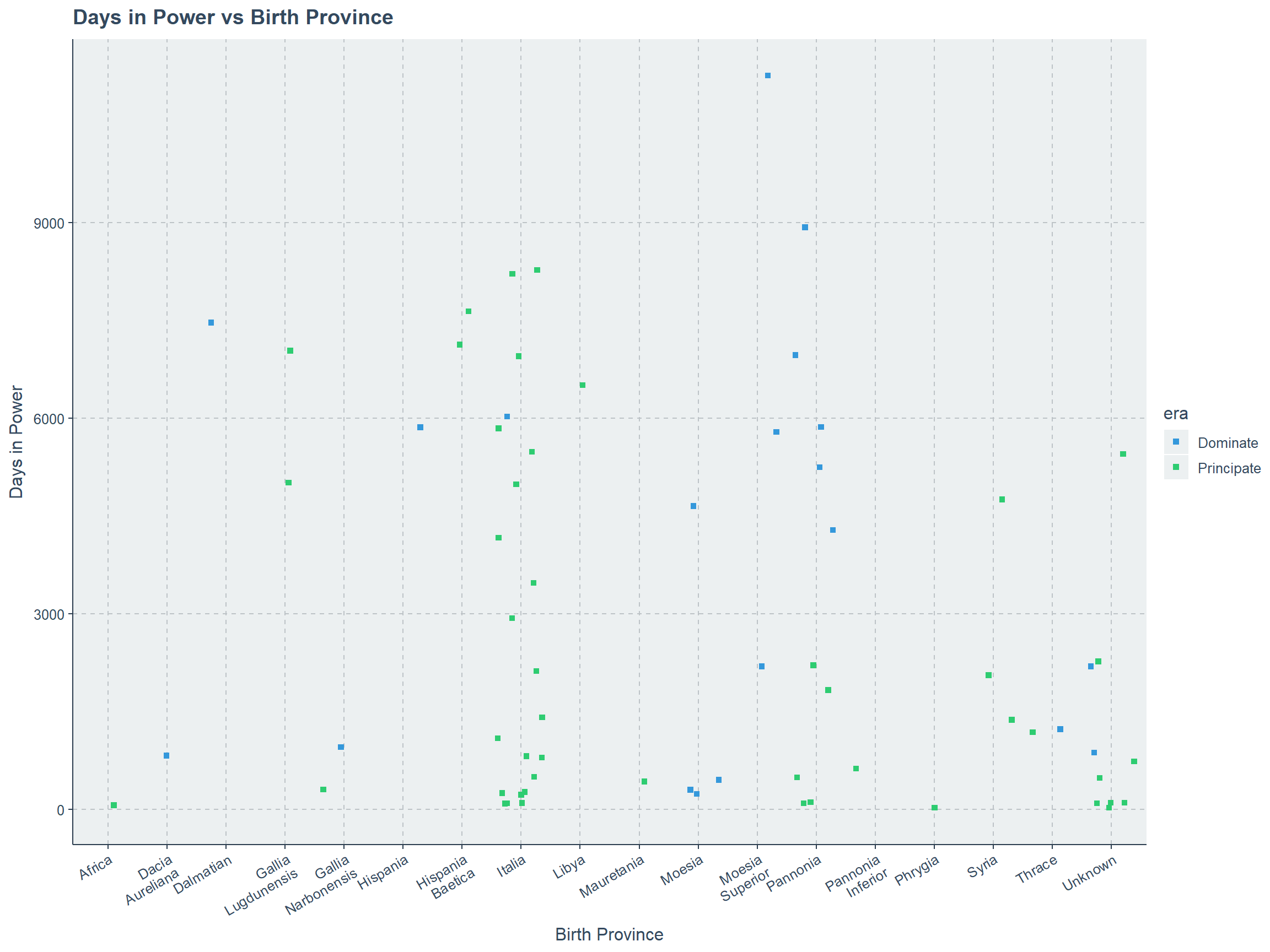
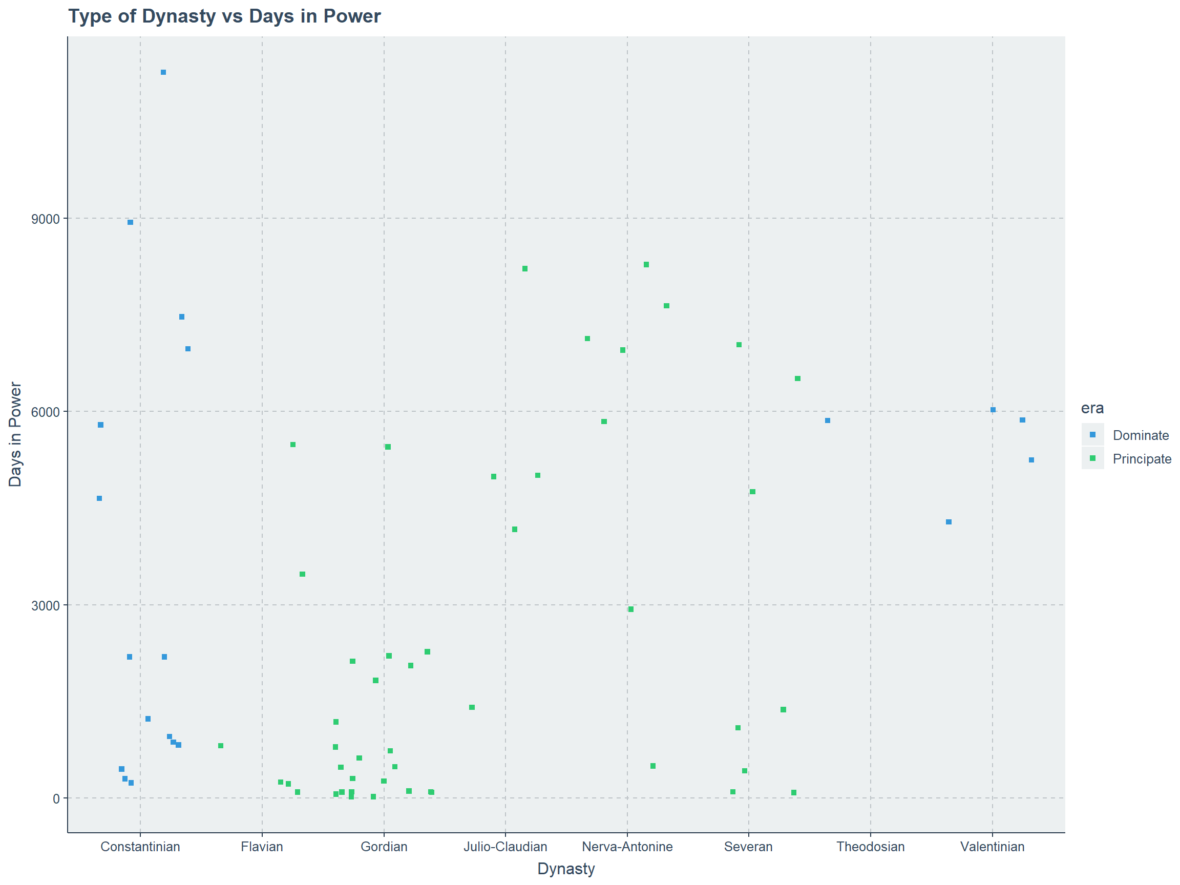
Second set of plots are based on Reign Time or Time in Power with few other categorical variables.
emperors %>%
  mutate(reign_time=reign_end-reign_start) %>%
ggplot(.,aes(stringr::str_wrap(rise,12),abs(reign_time),color=era))+
  ggtitle("Type of technique getting to power vs Days in Power")+
  geom_jitter(shape=15)+
  xlab("Rise")+ylab("Days in Power")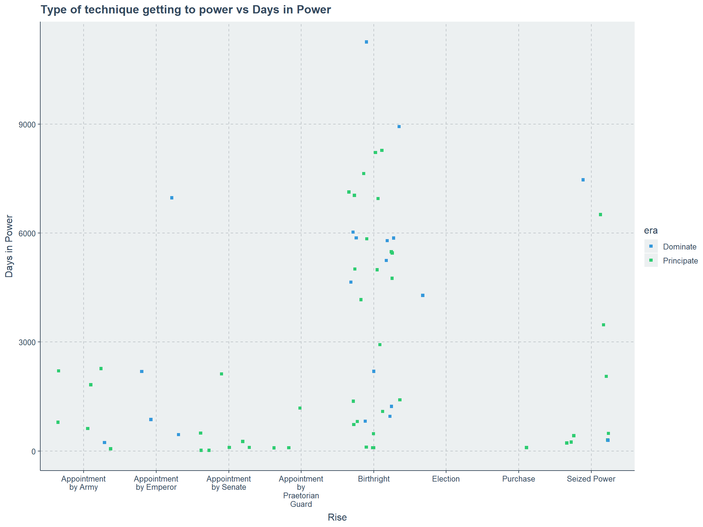
emperors %>%
  mutate(reign_time=reign_end-reign_start) %>%
ggplot(.,aes(stringr::str_wrap(cause,12),abs(reign_time),color=era))+
  geom_jitter(shape=15)+
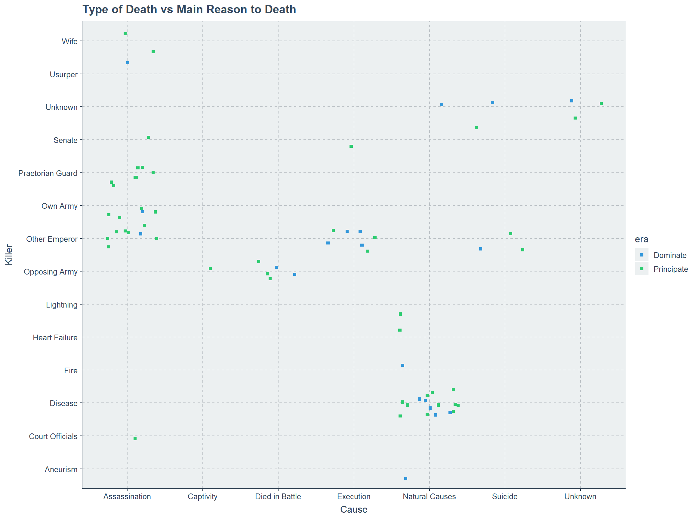
  ggtitle("Type of Death vs Days in Power")+
  xlab("Cause")+ylab("Days in Power")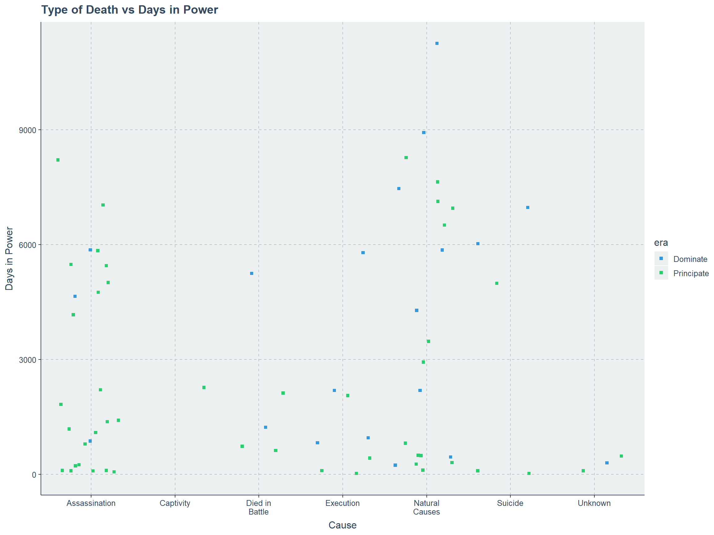
Cause and Killer
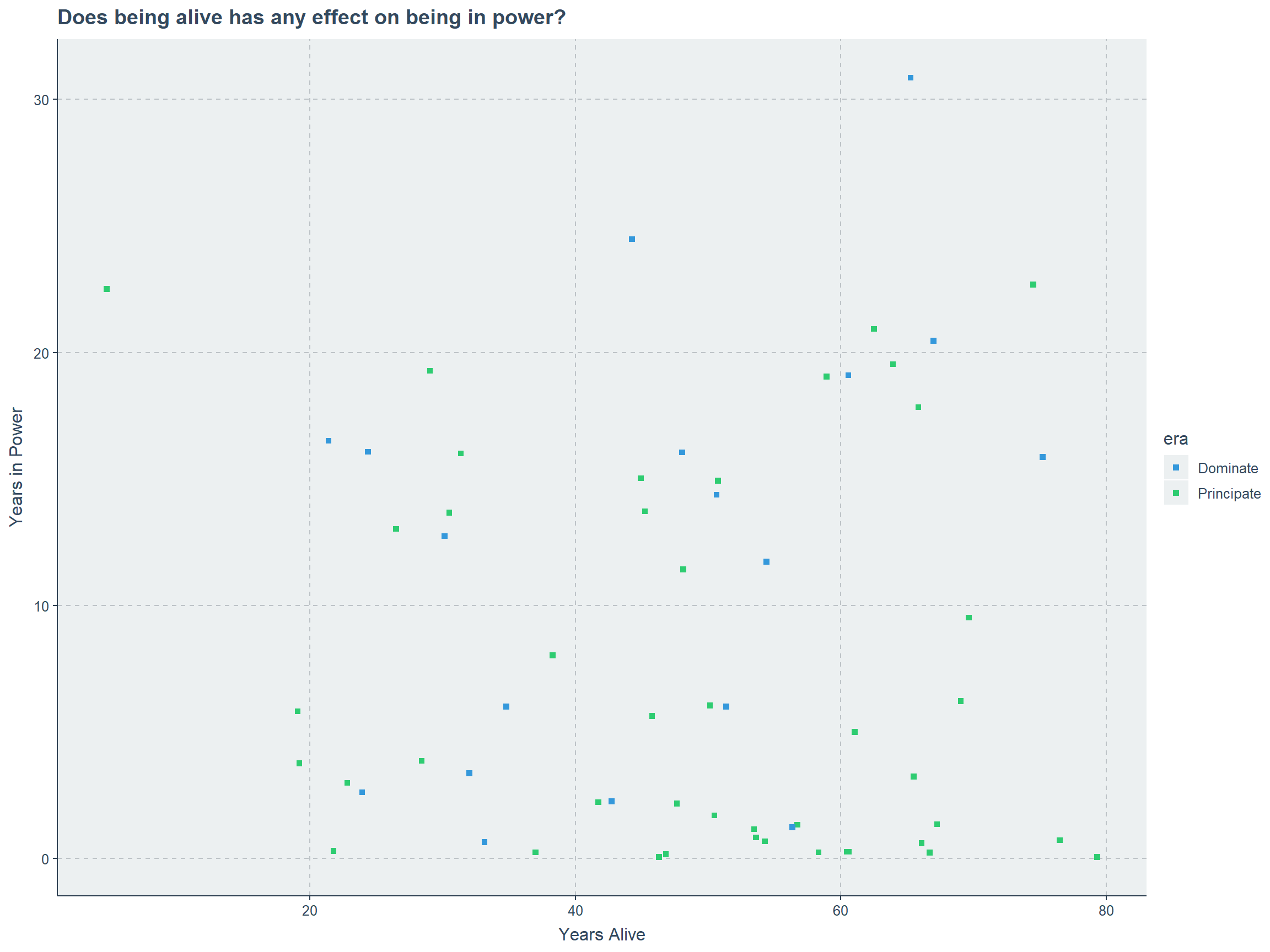
Days in Power vs Days Alive
Using ggpol package
ggpol package is used to plot parliament data. Thankfully, we can summary the data and produce the plots as below.
Era
# character to factor type
emperors$era<-factor(emperors$era)

emperors %>%
  count(era) %>%
ggplot(.) +
  geom_parliament(aes(seats = n, fill = era)) +
  scale_fill_manual(values=c("red","yellow"),labels = unique(emperors$era))+
  ggtitle("Count based on Era")+
  coord_fixed() + theme_void()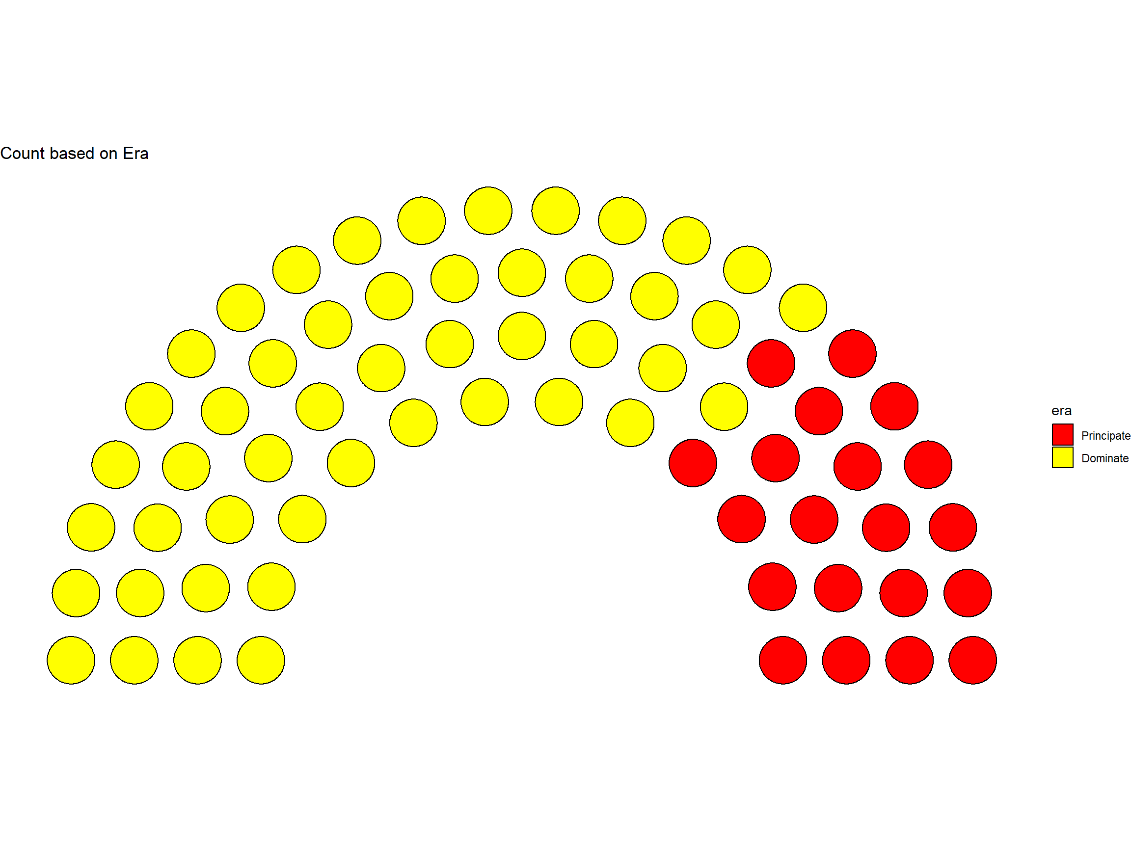
Risen to Power
# character to factor type
emperors$rise<-factor(emperors$rise)

emperors %>%
  count(rise) %>%
ggplot(.) +
  geom_parliament(aes(seats = n, fill = rise)) +
  scale_fill_manual(values=blues9,labels = unique(emperors$rise))+
  coord_fixed() + theme_void()
Cause of Death
# character to factor type
emperors$cause<-factor(emperors$cause)

emperors %>%
  count(cause) %>%
ggplot(.) +
  geom_parliament(aes(seats = n, fill = cause)) +
  scale_fill_manual(values=blues9,labels = unique(emperors$cause))+
  coord_fixed() + theme_void()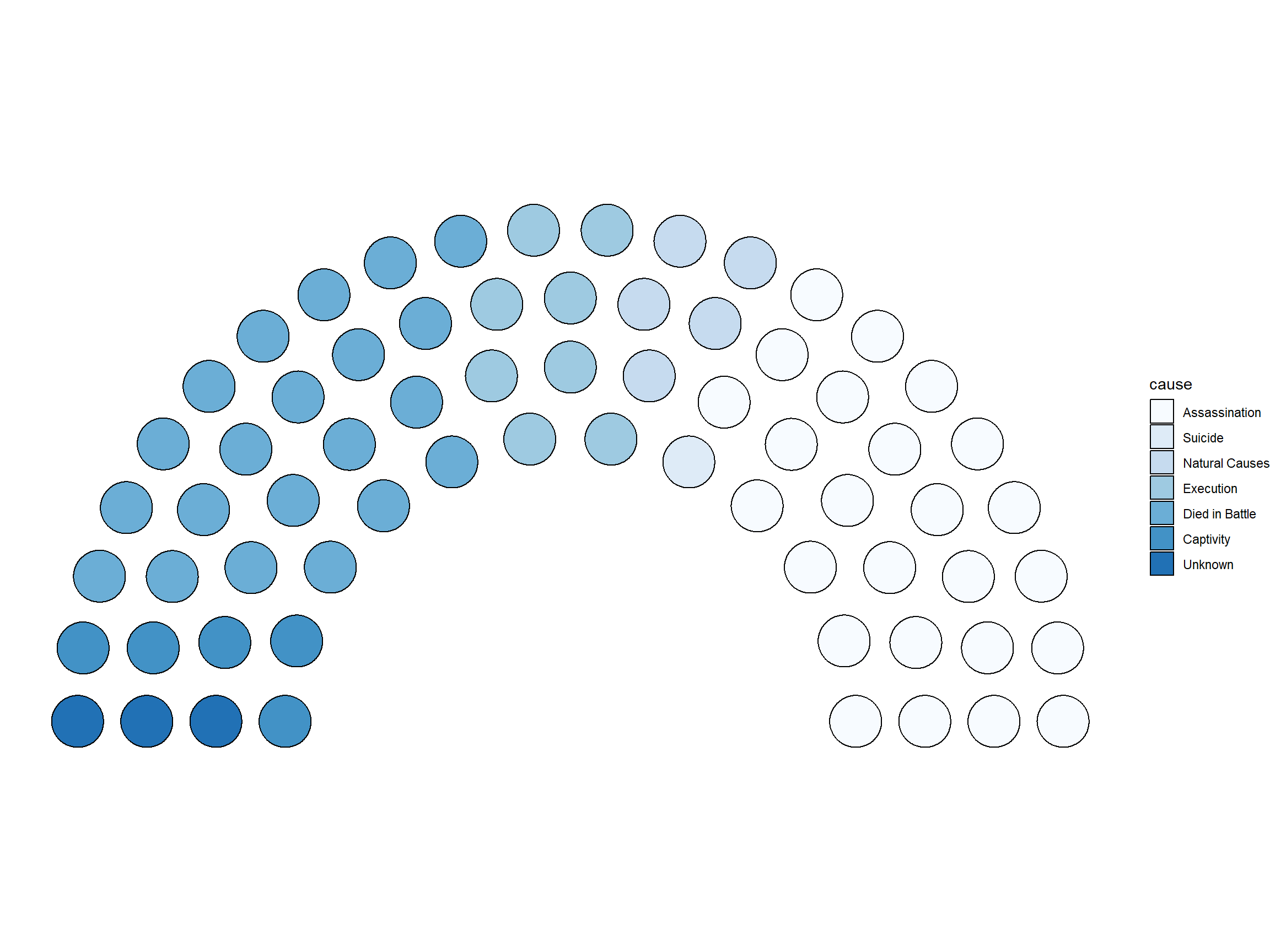
Killer
# character to factor type
emperors$killer<-factor(emperors$killer)

emperors %>%
  count(killer) %>%
ggplot(.) +
  geom_parliament(aes(seats = n, fill = killer)) +
  scale_fill_manual(values=c(blues9,"red","yellow","green","grey","black"),
                    labels = unique(emperors$killer))+
  coord_fixed() + theme_void()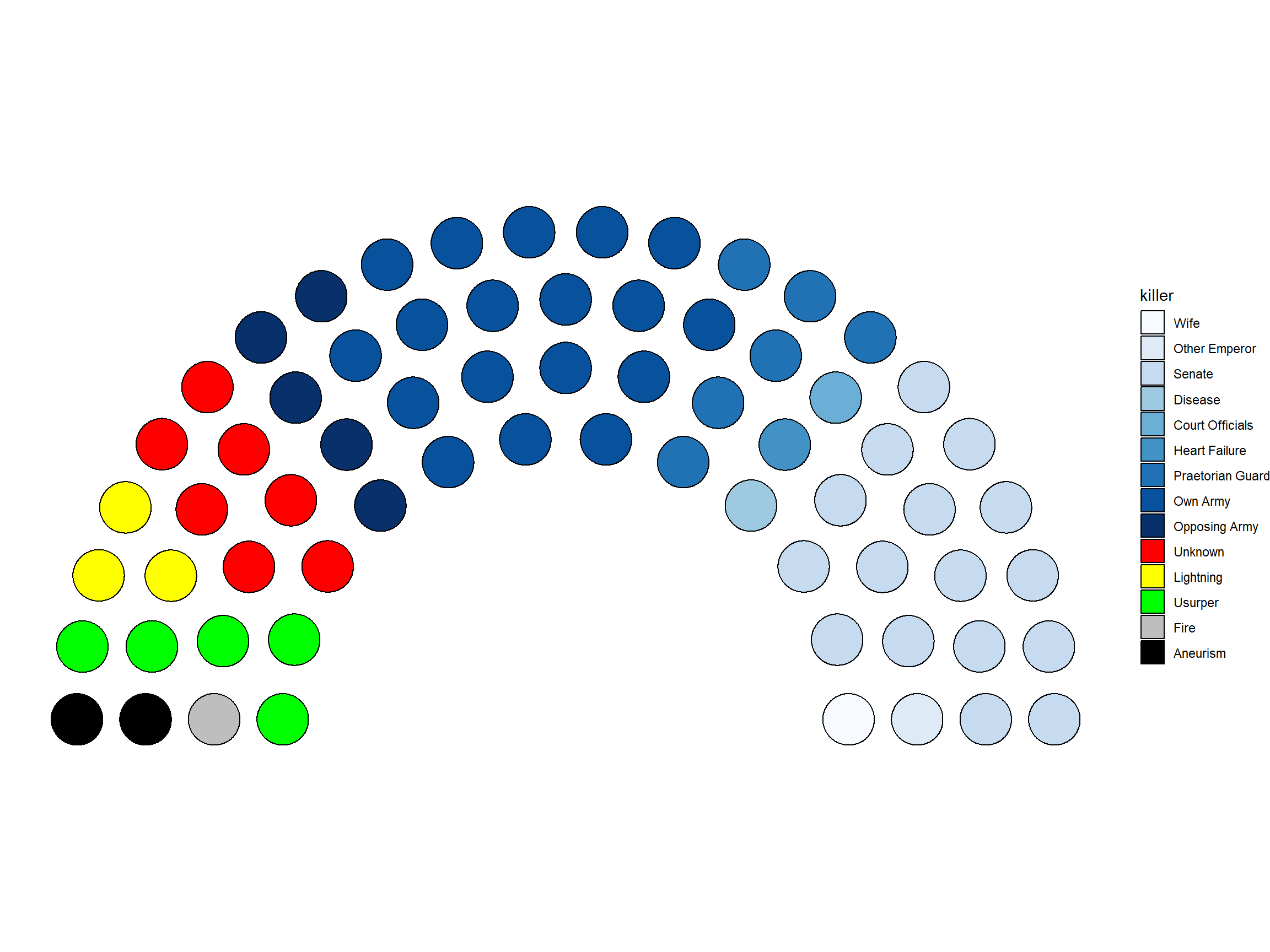
Dynasty
# character to factor type
emperors$dynasty<-factor(emperors$dynasty)

emperors %>%
  count(dynasty) %>%
ggplot(.) +
  geom_parliament(aes(seats = n, fill = dynasty)) +
  scale_fill_manual(values=blues9,labels = unique(emperors$dynasty))+
  coord_fixed() + theme_void()
The ‘ggpol’ plots seem fine, to be fair they would be much more cool if we have a proper color palette. Also it would make more sense if the number of observations are higher also but not above 500. Rather than that it looks fine.
THANK YOU
