# load the packages
library(tidyverse)
library(magrittr)
library(ggthemr)
library(readr)
library(gganimate)
library(usmap)

# load the data
fluid_milk_sales <- read_csv("fluid_milk_sales.csv")
state_milk_production <- read_csv("state_milk_production.csv")
clean_cheese <- read_csv("clean_cheese.csv")

# load the theme
ggthemr("flat dark")Week 5: Dairy Products in USA
Introduction
5 data-sets are given here, but I will be only discussing 3. They are Fluid Milk Sales, State Milk production and Clean Cheese. Clean Cheese has only few rows (48) and few columns (17). This is not the case in Fluid Milk Sales and State Milk production.
Fluid Milk Sales
Fluid Milk Sales has information for 9 different types of milk and how their Consumption in Pounds has changed over time from 1970 to 2017. We can see how Whole and Reduced Fat(2%) type milk are changing over the years with significant amount. Further, We can see how other types are changing from the initial order in 1970 of lower(Eggnog) amount to higher(Whole) amount in pounds over the years.
attach(fluid_milk_sales)

fluid_milk_sales$pounds<-fluid_milk_sales$pounds/(10^7)

# how sales change over the years for 9 different types of milk
p<-ggplot(fluid_milk_sales,aes(x=fct_inorder(milk_type) ,y=pounds,fill=year))+
       geom_bar(stat="identity")+
        transition_time(year)+ease_aes("linear")+
       xlab("Milk Type")+ylab("Pounds (in 10^7)")+
       coord_flip()+
       ggtitle("Milk Type vs Pounds in year: {round(frame_time)}")

animate(p,nframes=48,fps=1)
detach(fluid_milk_sales)State Milk Production
In the 48 years we are separating them by 24 years each for a plot. Using usmap package I am going to plot it into their respective states in perspective of Milk Produced lbs in 10^6.
US States and Milk Production Over the Years
In the first half of 1970 to 1993 we can see how a few states are having steady increase over the years.
attach(state_milk_production)

# dividing the milk produced by 10^6
#summary(state_milk_production$milk_produced)
state_milk_production$milk_produced<-state_milk_production$milk_produced/(10^6)

# plot in us map the milk produced by state for years 1970 to 1993
plot_usmap(data=subset(state_milk_production,year <="1993"),values = "milk_produced")+
          facet_wrap(~factor(year),ncol = 4)+
          ggtitle("Over the years Milk production changing in USA")+
          theme(legend.position = "left")+
          labs(fill="lbs in 10^6")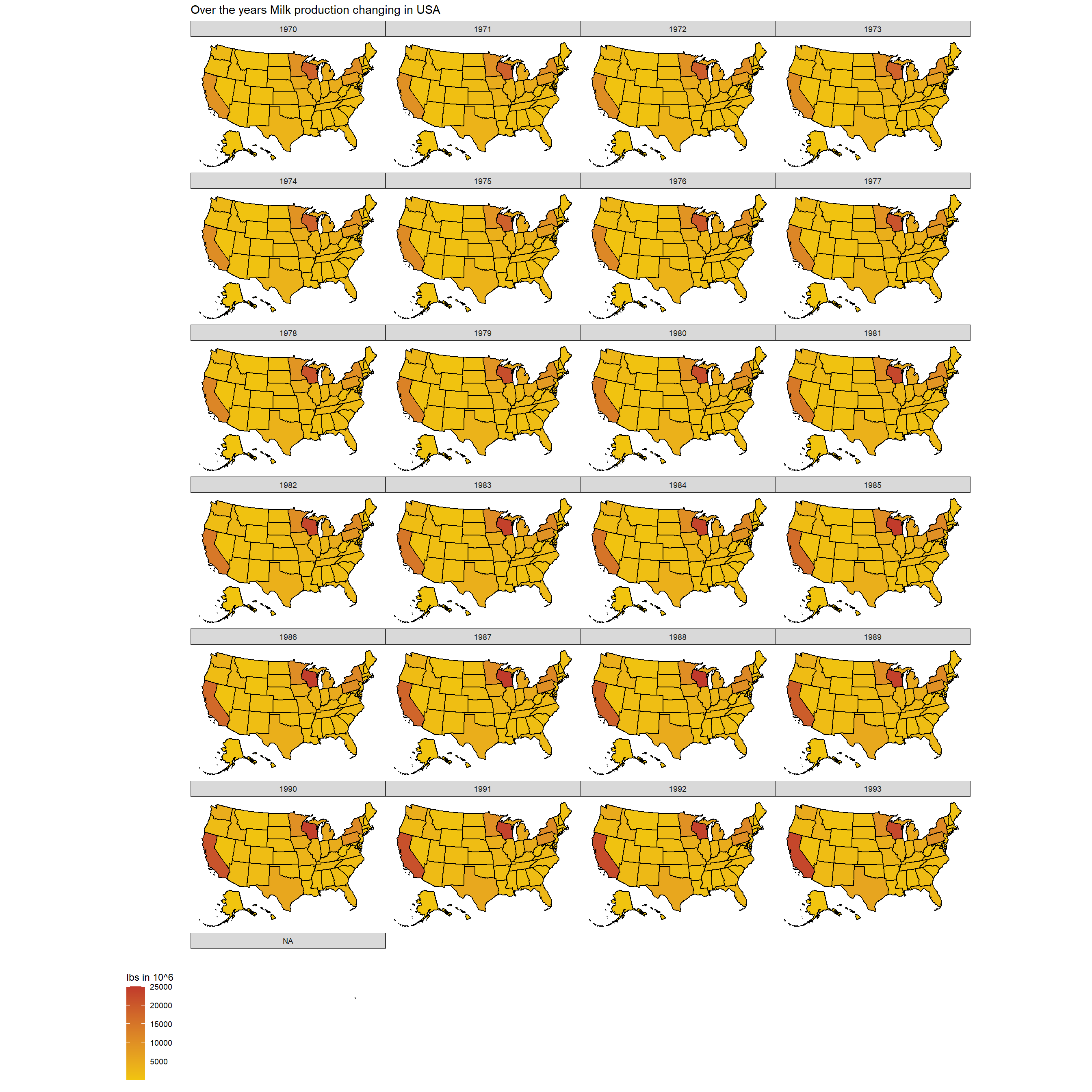
This is similar to the next half which is from 1994 to 2017 as well. Similar increase occurs for the above same states as I see in the below plot. Well it is not very accurately described in the two plots for us to see.
# plot in us map the milk produced by state for years 1994 to 2017
plot_usmap(data=subset(state_milk_production,year >"1993"),values = "milk_produced")+
          facet_wrap(~factor(year),ncol = 4)+
          ggtitle("Over the years Milk production changing in USA")+
          theme(legend.position = "left")+
          labs(fill="lbs in 10^6")
To understand the above same change over the years clearly I have created a bar plot how the increase occurs. This plot also indicates how much change has occurred over the 48 years for each state who produces milk. Clearly the states California and Wisconsin have higher increase over the years, which is very strong. There are some states which have not produced more amount each year than their previous years.
The states Wyoming, Rhode island, Hawaii, Delaware and Alaska have very low amount of milk production over the years.
# over the years how milk production has changed for each year in a bar plot
p<-ggplot(state_milk_production,aes(x=state,y=milk_produced,
                                    fill=year))+
      geom_bar(stat="identity")+coord_flip()+
      transition_time(year)+ease_aes("linear")+shadow_mark()+
      xlab("State")+ylab("Milk Produced (in 10^6)")+
      ggtitle("States vs Milk Produced in year: {round(frame_time)}")

animate(p,nframes = 48,fps=1)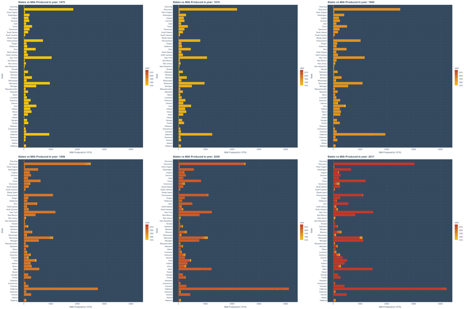
Summing States of Same Regions Over the Years
There are 50 states but only 10 regions and not all regions have equal amount of states. Therefore I am going to sum up the milk production for all regions over the years and try to understand if there is any pattern.
In order to do this I have used the dplyr package and created a function which would sum up the production for each region of each year. Similarly, this function has the ability to get the average production for each region of each year as well.
# manipulating the data by sum and mean
by_region_sum<-function(i,ch_sum)
{
  if(ch_sum==TRUE)
  {
    # subsetting by summation over all years for each region
    temp<-subset(state_milk_production,year==i,select=c("region","milk_produced")) %>%
                  group_by(region) %>%
                  summarise_each(funs(sum))

  output<-data.frame(year=rep(i,10), region=temp$region, milk_produced=temp$milk_produced)
  }
  else
  {
    # subsetting by Average over all years for each region
    temp<-subset(state_milk_production,year==i,select=c("region","milk_produced")) %>%
                  group_by(region) %>%
                  summarise_each(funs(mean))

    output<-data.frame(year=rep(i,10), region=temp$region, milk_produced=temp$milk_produced)
  }
  return(output)
}
Using the by_region_sum function I am now finding the sum as below.
# subsetting by summation
milk_region_data<-rbind.data.frame(by_region_sum(1970,T),by_region_sum(1971,T),
                                   by_region_sum(1972,T),by_region_sum(1973,T),
                                   by_region_sum(1974,T),by_region_sum(1975,T),
                                   by_region_sum(1976,T),by_region_sum(1977,T),
                                   by_region_sum(1978,T),by_region_sum(1979,T),
                                   by_region_sum(1980,T),by_region_sum(1981,T),
                                   by_region_sum(1982,T),by_region_sum(1983,T),
                                   by_region_sum(1984,T),by_region_sum(1985,T),
                                   by_region_sum(1986,T),by_region_sum(1987,T),
                                   by_region_sum(1988,T),by_region_sum(1989,T),
                                   by_region_sum(1990,T),by_region_sum(1991,T),
                                   by_region_sum(1992,T),by_region_sum(1993,T),
                                   by_region_sum(1994,T),by_region_sum(1995,T),
                                   by_region_sum(1996,T),by_region_sum(1997,T),
                                   by_region_sum(1998,T),by_region_sum(1999,T),
                                   by_region_sum(2000,T),by_region_sum(2001,T),
                                   by_region_sum(2002,T),by_region_sum(2003,T),
                                   by_region_sum(2004,T),by_region_sum(2005,T),
                                   by_region_sum(2006,T),by_region_sum(2007,T),
                                   by_region_sum(2008,T),by_region_sum(2009,T),
                                   by_region_sum(2010,T),by_region_sum(2011,T),
                                   by_region_sum(2012,T),by_region_sum(2013,T),
                                   by_region_sum(2014,T),by_region_sum(2015,T),
                                   by_region_sum(2016,T),by_region_sum(2017,T)
                                   )
If we consider the summation we can see clearly how centered and very limited variation is there for some regions such as Southeast, Northern Plains, Delta States, Corn Belt and Appalachian. There is some variation in the Northeast region. Clear and highest variation is in for Pacific, Mountain and Lake States regions.
# Region wise total milk production changing  over the year
ggplot(milk_region_data,aes(x=region,y=milk_produced,color=year))+
        geom_jitter()+ coord_flip()+
        xlab("Region")+ylab("Milk Produced (in 10^6)")+
        ggtitle("Total Milk Produced by Year in All Regions")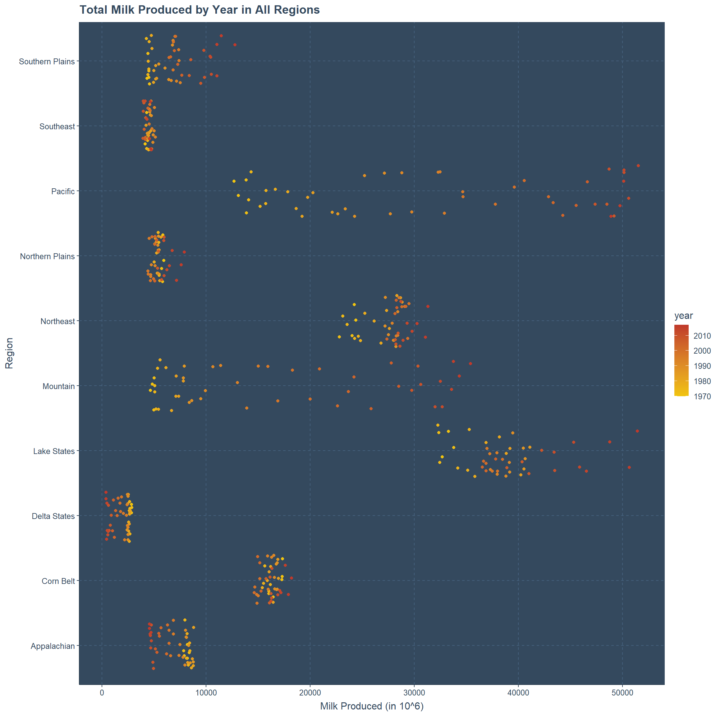
Below is the same graph with points animated by year.
# Region wise total milk production changing  over the year animated
p<-ggplot(milk_region_data,aes(x=region,y=milk_produced,color=year))+
        geom_jitter()+ coord_flip()+
        xlab("Region")+ylab("Milk Produced (in 10^6)")+
        ggtitle("Total Milk Produced for All Regions for Year: {frame_time}")+
        transition_time(year)+ease_aes("linear")+shadow_mark()

animate(p,nframes=48,fps=1) 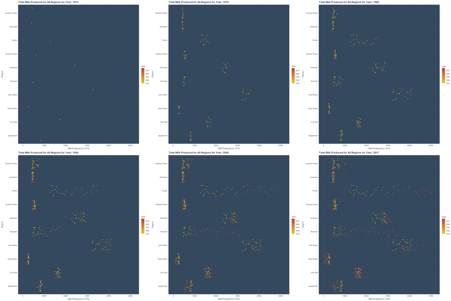
Averaging Regions Considering All the States Over the Years
If we consider the same approach but for the average of each region we can develop the same two plots. Here also we can see the same variation and centering for points for the same regions over the years.
# subsetting by average
milk_region_data_new<-rbind.data.frame(by_region_sum(1970,F),by_region_sum(1971,F),
                                   by_region_sum(1972,F),by_region_sum(1973,F),
                                   by_region_sum(1974,F),by_region_sum(1975,F),
                                   by_region_sum(1976,F),by_region_sum(1977,F),
                                   by_region_sum(1978,F),by_region_sum(1979,F),
                                   by_region_sum(1980,F),by_region_sum(1981,F),
                                   by_region_sum(1982,F),by_region_sum(1983,F),
                                   by_region_sum(1984,F),by_region_sum(1985,F),
                                   by_region_sum(1986,F),by_region_sum(1987,F),
                                   by_region_sum(1988,F),by_region_sum(1989,F),
                                   by_region_sum(1990,F),by_region_sum(1991,F),
                                   by_region_sum(1992,F),by_region_sum(1993,F),
                                   by_region_sum(1994,F),by_region_sum(1995,F),
                                   by_region_sum(1996,F),by_region_sum(1997,F),
                                   by_region_sum(1998,F),by_region_sum(1999,F),
                                   by_region_sum(2000,F),by_region_sum(2001,F),
                                   by_region_sum(2002,F),by_region_sum(2003,F),
                                   by_region_sum(2004,F),by_region_sum(2005,F),
                                   by_region_sum(2006,F),by_region_sum(2007,F),
                                   by_region_sum(2008,F),by_region_sum(2009,F),
                                   by_region_sum(2010,F),by_region_sum(2011,F),
                                   by_region_sum(2012,F),by_region_sum(2013,F),
                                   by_region_sum(2014,F),by_region_sum(2015,F),
                                   by_region_sum(2016,F),by_region_sum(2017,F)
                                   )
Below is the plot for the average of regions over the years.
# Region wise average milk production changing  over the year
ggplot(milk_region_data_new,aes(x=region,y=milk_produced,color=year))+
        geom_jitter()+ coord_flip()+
        xlab("Region")+ylab("Milk Produced (in 10^6)")+
        ggtitle("Average Milk Produced by Year in All Regions")
The same plot is now animated for each year and all regions.
# Region wise average milk production changing  over the year animated
p<-ggplot(milk_region_data_new,aes(x=region,y=milk_produced,color=year))+
        geom_jitter()+ coord_flip()+
        transition_time(year)+ease_aes("linear")+ shadow_mark()+
        xlab("Region")+ylab("Milk Produced (in 10^6)")+
        ggtitle("Average Milk Produced for All Regions for Year: {frame_time}")+
        transition_time(year)+ease_aes("linear")

animate(p,nframes=48,fps=1) 
detach(state_milk_production)Cheese
16 types of cheese are provided in this clean cheese data-set. I will divide these types into 3 types and will not consider few types of cheese. The unit of measurement for the consumption is lbs per person.
Cheese with Other
I am going to consider the types American Other, Italian Other and Swiss for this plot. Red color indicates to American Other, yellow color refers to Italian other and blue for Swiss. Alot of fluctuation for American other type, but this is not the case for Swiss type cheese. There is steady increase for the Italian other type cheese over the years. All of these are less than 4 lbs per person and it is animated.
# 3 types of cheese change per person over the year in lbs
p<-ggplot(clean_cheese,aes(x=factor(Year)))+
          geom_point(aes(y=`American Other`),stat="identity",color="red")+
          geom_point(aes(y=`Italian other`),stat="identity",color="yellow")+
          geom_point(aes(y=Swiss),stat="identity",color="blue")+
          transition_time(Year)+
          theme(axis.text.x =element_text(angle = 90, hjust = 1))+
          xlab("Year")+ylab("Consumption in lbs per person")+
          ggtitle("Cheese Consumption Over the Years")+
          ease_aes("linear")+shadow_mark()

animate(p,nframes=48,fps=1)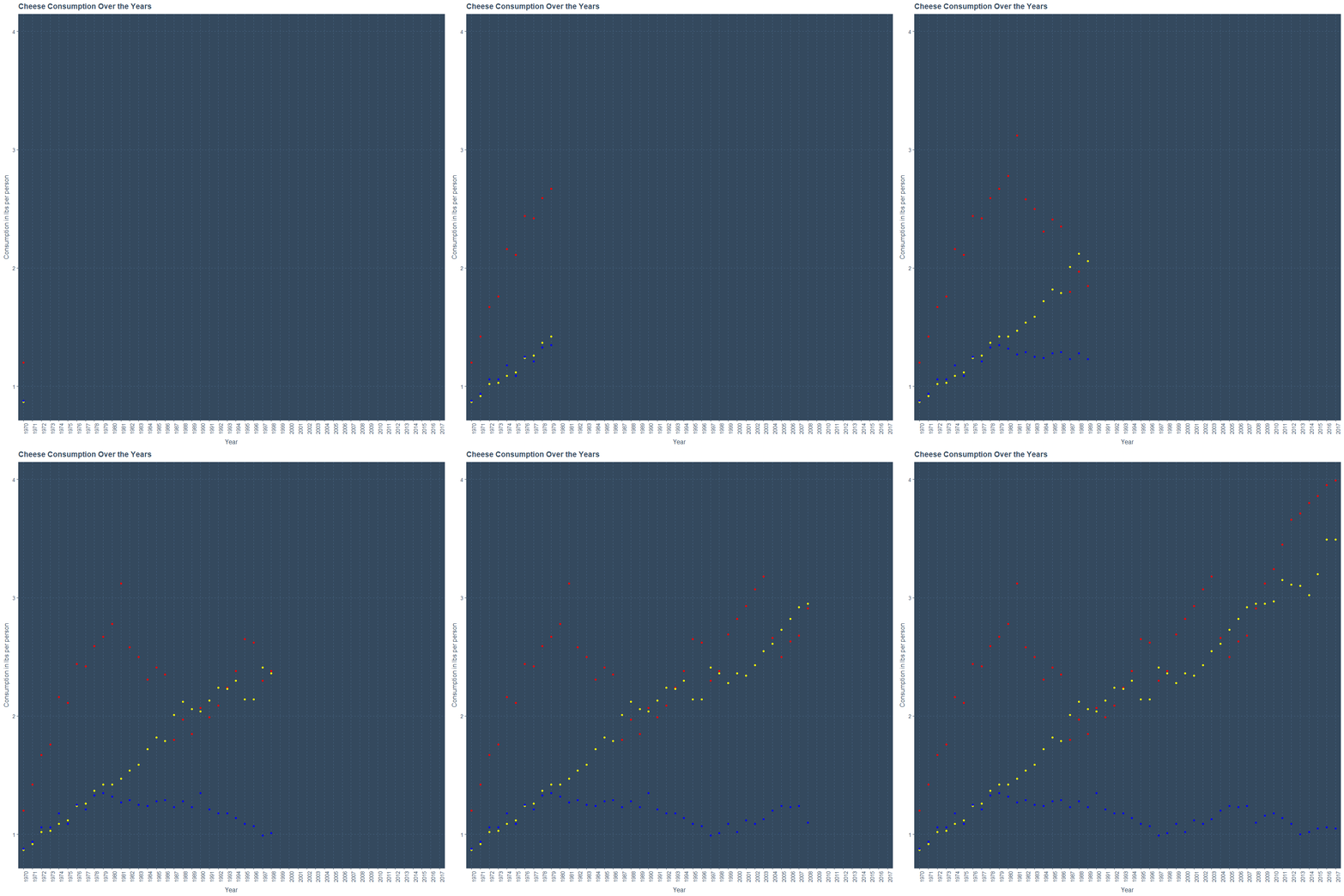
Cheese with Total
This is also an animated plot but for the cheese types which has the word Total. They are Total American Cheese, Total Italian Cheese, Total Natural Cheese and Total Processed Cheese Products with the colors represented respectively red, yellow, blue and green.
All the Consumption units are in between 0 to 40 lbs per person. Clearly Total Natural Cheese has a steady amount of increase from 1970(slightly above 10) to 2017(approximately less than 40). Considering the other three types we can see it is not the same order that it is in 1970 over the years.
# 4 types of cheese change per person over the year in lbs
p<-ggplot(clean_cheese,aes(x=factor(Year)))+
          geom_point(aes(y=`Total American Chese`),stat="identity",color="red")+
          geom_point(aes(y=`Total Italian Cheese`),stat="identity",color="yellow")+
          geom_point(aes(y=`Total Natural Cheese`),stat="identity",color="blue")+
          geom_point(aes(y=`Total Processed Cheese Products`),stat="identity",color="green")+
          xlab("Year")+ylab("Consumption in lbs per person")+
          theme(axis.text.x =element_text(angle = 90, hjust = 1))+
          ggtitle("Cheese Consumption Over the Years")+
          transition_time(Year)+
          ease_aes("linear")+shadow_mark()

animate(p,nframes=48,fps=1)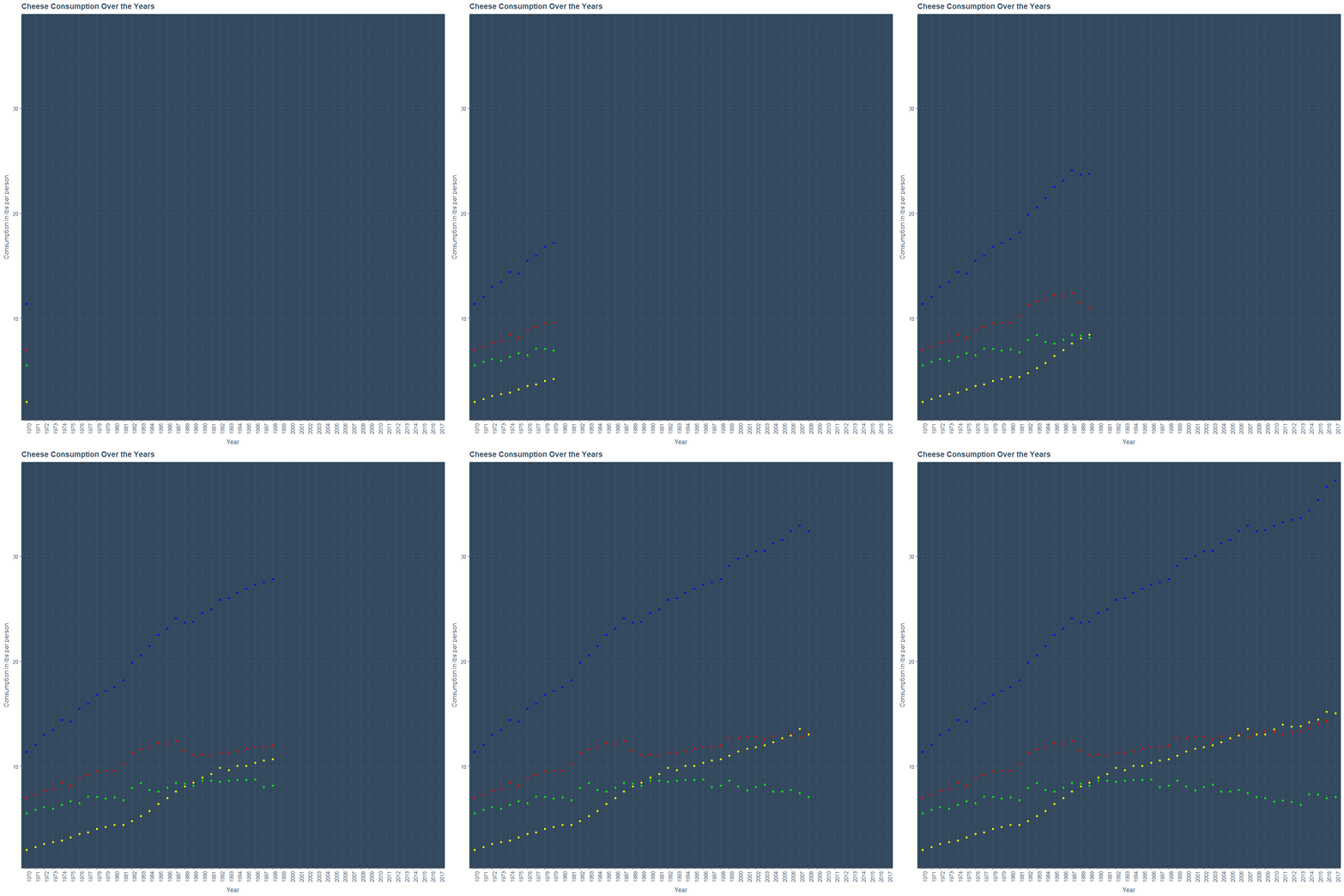
Cheese with known Type Names
Next group of cheese types include Cheddar, Mozzarella, Brick, Processed Cheese and Foods & spreads for the colors representing respectively red, yellow, blue, green and white. Clearly Cheddar and mozzarella type cheese are are mostly consumed by 2017 above 10 lbs per person, but this is not the case in 1970 where consumption is less than 6 lbs per person.
Well Processed Cheese and Foods & Spreads have changed very small over the years. The consumption is always less than 6 lbs per person. This is not the case for Brick type cheese where the consumption is close to zero over the years from 1970 until 2017.
# 5 types of cheese change per person over the year in lbs
p<-ggplot(clean_cheese,aes(x=factor(Year)))+
          geom_point(aes(y=Cheddar),stat="identity",color="red")+
          geom_point(aes(y=Mozzarella),stat="identity",color="yellow")+
          geom_point(aes(y=`Brick`),stat="identity",color="blue")+
          geom_point(aes(y=`Processed Cheese`),stat="identity",color="green")+
          geom_point(aes(y=`Foods and spreads`),stat="identity",color="white")+
          xlab("Year")+ylab("Consumption in lbs per person")+
          theme(axis.text.x =element_text(angle = 90, hjust = 1))+
          ggtitle("Cheese Consumption Over the Years")+
          transition_time(Year)+
          ease_aes("linear")+shadow_mark()

animate(p,nframes=48,fps=1)
THANK YOU